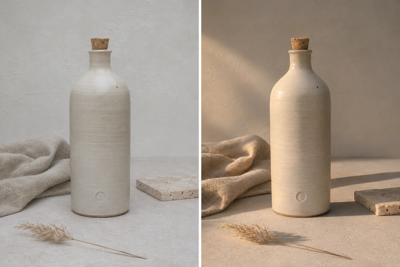
A product photograph is usually good enough and never good enough. The bottle is in focus, the label is readable, the file is sharp — and it still looks like it was taken on a kitchen table at four in the afternoon, because it was. The listing needs it on travertine by Monday, at golden hour, in a bathroom, on a bar shelf, and in a clean white studio frame. Nobody is booking five shoots for one bottle.
That gap — one honest file, five contexts, no reshoot — is what an image to image editor is for, and it is also where most people ruin their first attempt. They upload the photo, type "make it professional," and get back something beautiful that is no longer their product. The label has drifted. The cap is a slightly different cap. The proportions are off by eight percent in a way that is hard to name and impossible to unsee once a client points at it.
This guide is about closing that gap deliberately. It covers how the current generation of editing models actually works, why the phrase "Krea 3 AI" now describes two different things that people keep confusing, how to write an edit brief that survives, and how to build a set of images from a single upload. The worked example is Krea 3, an independent browser workspace that wraps several image models behind one prompt bar, read on November 6, 2026. It is not affiliated with Krea AI, and this page is published on happyhorse2.video, which does not run that workspace.
Five searches, one workflow, two different products
People reach this topic through five phrases, and the phrases are not synonyms. Getting them straight saves a wasted afternoon and, in some cases, a wasted payment.
Krea 3 AI is the model name, and in late 2026 it is genuinely ambiguous. Krea AI revealed Krea 3 as a foundation model at a private New York event on August 28, 2026, describing it as a step up from Krea 2 with editing as a first-class capability rather than a bolt-on. At the reveal it was a preview, not a shipped product. Krea then released an image editing model under the same name in October 2026, with edits returning in under eight seconds at native 2K and API pricing around six cents an image at 2K. Several independent sites also publish editors under the "Krea 3" label. So the phrase can mean the preview, the released model, or a third-party workspace built around the same idea. Knowing which one you are reading about matters, because only two of the three can actually process your upload today.
Krea 3 AI Image Editor is the job, stated as a product. You have a picture and want a specific thing about it changed: the light, the backdrop, the colour of a garment, the clutter behind a subject. This is an edit, and the input is the point.
Krea 3 Image Generator is the opposite starting position. Nothing exists yet. You want a hero image for a page with no photography budget, a mood board, a concept for a shoot that has not happened. There is no file to protect, so the only craft is in the description.
AI Photo Editor is the widest phrase of the five. It is what someone types when they have a photo and a problem, without yet knowing whether the answer is a mask, a prompt, or a slider. It also carries the least information about quality, because everything from a one-tap skin smoother to a full generative model calls itself one.
AI Image to Image Generator is the mechanic, named precisely. Image in, image out, with the source acting as a spatial anchor and a text instruction acting as the change. This is the phrase that describes what is actually happening under the prompt bar, and understanding it is the difference between a workflow that converges and one that drifts.
Read together, those five describe one tool with two front doors. Attach a photo and the same prompt bar is an editor. Leave the tray empty and it is a generator. The interesting part is not that both exist — every modern image platform has both. It is that the same account, the same model list, and the same credit balance cover both, so a campaign can start as a generated concept and finish as an edit of a real product without changing tools in the middle.
| The phrase | What the person actually has | What they need |
|---|---|---|
| Krea 3 AI | A name they read somewhere | To know which product it refers to |
| Krea 3 AI Image Editor | A photo with one flaw | A targeted, prompt-led change |
| Krea 3 Image Generator | A blank page and a deadline | A first frame, fast |
| AI Photo Editor | A photo and a vague problem | Help choosing the right operation |
| AI Image to Image Generator | A photo and a clear change | Control over what survives the edit |
What is actually happening when you edit a photo
The mystique is unhelpful here. Image to image is a well-understood mechanism, and knowing it changes how you write.
The classical version, described in the SDEdit paper in 2021, adds a calibrated amount of noise to your image and then denoises it back toward something that both resembles your input and matches your text. A setting called denoising strength — sometimes called strength, or image weight — controls how much noise goes in. At zero the picture is returned untouched. At one the input is effectively ignored and you are back to text to image. Most useful work sits between roughly 0.3 and 0.7, where composition survives and materials, light and atmosphere can genuinely change.
The newer version replaces that dial with instruction following. InstructPix2Pix in 2022 trained a model to take an image plus a written instruction, and current editing models extend that with vision-language encoders, multiple reference images and, in the strongest cases, regional control over where the change is allowed to happen. Krea AI's own technical report for its editing model describes an architecture where reference images are encoded and injected as clean tokens alongside the instruction, and where the training pipeline deliberately concentrates compute at high noise levels — because that is where global structure gets decided.
Two consequences follow, and they explain almost every piece of advice in this guide.
First, the pixels you wanted to keep are being reconstructed, not preserved. The bottle in your output is not your bottle pasted onto a new background. It is a new bottle, drawn from an internal description of your bottle. When that description is faithful, the result looks identical. When it is approximate — small type, fine jewellery, a complex logo — the approximation shows up.
Second, anything you did not mention is left to the model's discretion. A prompt that says only what should change hands over every other decision. A prompt that also names what must stay is not politeness; it is a constraint on the reconstruction.
That is the whole risk model, and it is why the single most valuable sentence in an edit brief is the one that lists what must not move.
Why a relight is easier than a restyle
Not all edits carry the same risk, and the menu does not usually say so.
Relighting keeps every object, every edge and every position, and changes only where the light comes from and how it falls. The model has a strong prior for this — it has seen a lot of photographs of the same object under different light — and the geometry of your source does most of the work. This is the safest high-impact edit available, and it is the one most likely to turn an ordinary file into something publishable.
Background and scene swaps replace everything that is not the subject. Slightly riskier, because the new background has to agree with the subject on perspective, contact shadow and colour temperature. A product that floats, or a shadow that falls the wrong way, reads as fake immediately even to people who could not explain why.
Recolouring a garment or an object is a middle case. The shape survives, but the model has to decide how the new colour behaves in highlight and shadow, and whether it bleeds into adjacent surfaces. A navy jacket asked to become olive will usually come back convincing; a jacket with a printed pattern asked to become a different pattern will usually not.
Full restyles — "make it look like an oil painting," "turn this into a film still" — are the highest risk in commercial work, because they redraw everything including the product. They are excellent for concepts and mood boards, and they are the wrong tool for a listing image. Treat any restyle as a new picture, not an edit of the old one.
The practical rule: name the smallest change that solves the problem, and protect the largest thing that must not break. Most failed edits come from asking for a restyle when a relight would have done the job.
Step one: audit the file before you spend anything
Ninety seconds of inspection saves credits and, more importantly, saves the afternoon you would otherwise spend generating near-misses.
Is there enough photograph? A tight crop gives the model very little context to extend. If the subject occupies a tenth of the frame and everything else is a wall, the model has to invent a set from almost nothing. Crop closer in any ordinary editor and upload that instead.
What is already competing for attention? A mug, a phone, a stack of receipts. You can ask for removal, but removal is hardest when the object overlaps the subject. If the object still exists in the world, move it and reshoot — a two-minute fix beats ten generations.
Is anything you need clipped? If the top of a label is out of frame, no prompt returns it. The model will invent a plausible top, and plausible is not the same as correct. The same applies to a hand, a shoulder, or the last letter of a brand name.
Is the light direction readable? A file with flat, directionless light is a gift to a relighting prompt, because there is nothing to contradict. A file with strong existing shadows is harder: the model has to remove them before it can place new ones, and that removal is where halos and smudges appear.
Keep the original. Never overwrite the source with a generated result. Every later step here assumes you can go back to the untouched file.
Step two: choose the operation, then the model
Two decisions, in this order, because they are not the same decision.
The operation is either generate or edit. Generate when the picture does not exist. Edit when it does and something about it must survive. Within edit, the operation is relight, swap, recolour or restyle, and you should pick the smallest one that works.
The model is a question about what you cannot afford to lose. Krea 3 lists GPT Image 2, Nano Banana Pro, Nano Banana 2, Nano Banana, Seedream 5 Lite, Seedream 4.5, Grok Imagine, Wan 2.7 Image and Qwen Image 2 behind one menu, and the differences between them are practical rather than tribal.
If the deliverable contains words — a poster, packaging, a price card, a sign in the frame — start where lettering holds best. On the current roster that usually means GPT Image 2, which the site also prices lowest at ten credits for a single image. A bad idea discovered at the cheapest tier costs less to discover.
If the deliverable will be zoomed or printed, start where detail and resolution are strongest. Nano Banana Pro and Nano Banana 2 support export up to 4K, which is the difference between a file that survives a product page and one that falls apart at full size.
If the deliverable is a character or a product that recurs across several frames, start where reference capacity is largest. Nano Banana 2 and the Seedream models accept up to fourteen reference images in one request; Wan 2.7 Image takes nine; Grok Imagine and Qwen Image 2 work from a single source. That capacity is what separates a coherent series from a pile of near-misses.
If you are exploring and expect to discard most results, draft at 1K on a mid-tier model and finish only the keeper at high resolution. The interface shows the credit cost next to the generate button before anything runs, so the decision is visible rather than discovered later on a statement.
| What must survive | Where to start | First setting |
|---|---|---|
| Readable words in the frame | GPT Image 2 | 1K draft, 2K final |
| Fine product detail for print | Nano Banana Pro | 2K or 4K |
| The same face across a series | Nano Banana 2 / Seedream | 2–4 references, 2K |
| Several assets combined in one brief | Nano Banana 2 / Seedream | Up to 14 references |
| A concept with no product yet | Any model, text only | 1K, three variations |
Step three: write the brief in four clauses
This is the part that decides whether the edit lands. A prompt that survives contact with a model has four clauses, and each one does a different job.
Clause one, the change. One verb, one target. "Replace the grey wall with warm travertine." Not five changes. When you ask for five, the model spreads its attention across five and none of them lands properly.
Clause two, the preserve list. Name the things that must not move: the bottle shape, the label, the cap, the camera angle, the crop. Use the words keep and unchanged, and be specific about the parts that carry commercial meaning. This is the clause that stops the reconstruction from wandering.
Clause three, material and light. Photographers think in surfaces and sources, and so should the prompt. Name the material of the new background, the direction and softness of the light, and whether there should be a visible contact shadow. "Two large diffused sources from camera left, crisp highlight down the left edge of the glass, soft shadow falling right" does far more than "professional lighting," because it describes a physical arrangement rather than a judgement.
Clause four, the output. Frame, crop, and what must not appear. "Portrait 3:4 for a product page, no text, no extra props, no watermark." Negative instructions are weak on their own, but as a final fence they are useful.
Here is the same request written badly and written well.
Make this product photo look premium.
That sentence hands the model permission to redesign the product, the label, the composition and the crop, because premium is an opinion rather than a specification. It is a coin flip that costs credits.
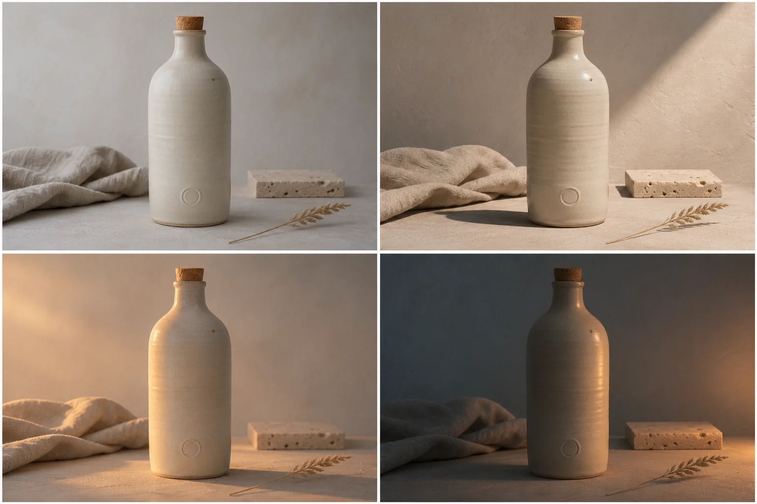
Relight this photograph as late-afternoon window light. Keep the stoneware bottle, its cork stopper, the debossed mark near the base, the bottle's exact height and shoulder curve, and the linen cloth on the left exactly as they are. Light enters from camera left at a low angle; a long crisp-edged shadow falls to the right across the plaster surface; a warm rim appears along the bottle's left contour; the shadow side keeps soft bounce light. Keep the camera position, the crop and the props unchanged. Portrait 3:4, no text, no watermark, no new objects.
The second version is longer, and every extra clause is doing work. It names the change, fences the product with specifics that a client would actually check, describes the light as an arrangement rather than a mood, and closes the frame.
One habit worth building: quote any word that must appear inside the image. Unquoted text becomes decoration. Quoted text is at least an attempt at lettering, and on the models that render lettering well it is often correct on the first pass — but verify it at 100 percent before it goes anywhere near a client.
Step four: build a set from one upload
A single good image is a demo. A set is a deliverable, and the difference is a system rather than a lucky prompt.
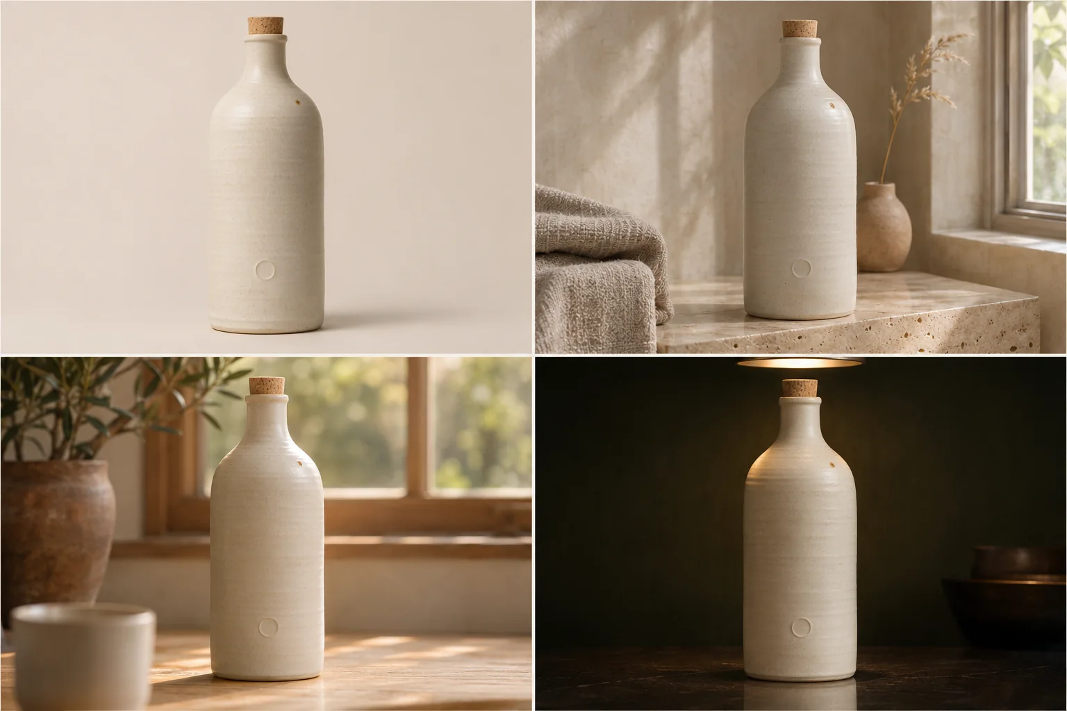
The four-panel example above is the ordinary shape of a small campaign: one product, four contexts, no reshoot. The bottle is identical in every panel because the same source file drove every render and the preserve clause named the bottle explicitly. What changes is the set, the props and the light. What does not change is the thing the buyer is actually buying.
Two habits make that reliable.
Build the preserve clause once, as a reusable block. Write out the product, the label, the proportions, the mark, the aspect ratio — the things that must be identical across the whole series — and paste that block into every prompt. Retyping it from memory each time is how a series acquires a bottle that grows two millimetres per image.
Change one variable per render. Set, then season, then format. Not all three at once. When something breaks, you will know which clause caused it, and you can fix one line instead of restarting the lottery.
For a character rather than a product, the same logic runs through the reference tray: a clear face, a wardrobe shot, a location and a style frame, plus a sentence explaining the role of each. The model needs to be told which image is the person and which is the mood, or it will average them into someone who is neither.
Step five: iterate from the original, not the last render
The instinct after a nearly-good result is to ask for one more change on top of it. Do that once and it is fine. Do it four times and you are editing a copy of a copy of a copy, and the drift is now structural rather than cosmetic. This is not a superstition: it is documented behaviour of whole-image regeneration, which is why the newer editing APIs expose a regional mode specifically so that repeated edits do not accumulate artifacts.
The better move is to return to the source file and issue a combined instruction: the original change plus the new one. Two edits from the source beat four in sequence, every time, and it keeps the history honest — when someone asks which version was approved, you can point at one prompt rather than a chain.
When a single detail is wrong — one letter, one reflection, one shadow — do not rewrite the whole prompt. Add one targeted correction and nothing else. "Keep everything identical; only straighten the second line of the label." Small specific follow-ups converge. Large rewrites restart the lottery.
Keep the prompt with the file. The library in these workspaces does this automatically, and your own folder structure should agree with it.
Step six: inspect like an editor, not a customer
At thumbnail size, almost everything looks finished. The failures live at 100 percent, and they cluster in predictable places.
Check the label first: every letter, in order, at full size. Then the silhouette: does the object have the same shoulder, the same neck, the same proportion as the file you uploaded? Then the contact shadow: a product that floats is the fastest way to make an otherwise good render look fake. Then the edges: hair, glasses, fingers, jewellery, the boundary between product and background. Then the mood: is the colour temperature consistent across the frame, or does the new background sit at a different hour of the day than the subject?
Five minutes of this on every result is the difference between a file you can publish and a file a client returns two days later with one polite sentence.
Where these tools still fail
Honesty is more useful than a feature list, so here is what does not work yet — with the caveat that this changes every few months.
Small type. A poster headline is often correct now. A ten-word ingredient list on a 30 ml bottle is not. If the words must be exact, set them afterwards in a layout tool.
Hands and fine jewellery. Fingers still merge. Rings still grow a sixth band. If a hand is in the hero frame, inspect it first and expect to re-run.
Logo fidelity. A model reconstructs a mark from an impression of a mark. If the mark is a registered asset, do not let a model draw it. Composite the real file in.
Exact colour. A hex value in the prompt nudges the palette; it does not guarantee it. Scene lighting shifts colour, and so does the model's own grade. Brand colours belong in post-production, where they can be measured.
Likeness and consent. Uploading a face you do not have the right to use is a legal problem, not a prompt problem. The same applies to celebrities, to a client's talent whose contract predates AI, and to children.
Marketplace rules. Some catalogues require a pure white background and no generated props. A beautiful lifestyle shot can still fail compliance. Read the platform's image policy before the shoot, not after the rejection.
Anything that has to be true. A generated bottle can be a different volume from the real one. A generated room can contain a window that does not exist. If the image makes a factual claim about a product, check the claim against the product rather than the render.
What it costs, and how to read a plan page
The mechanics are simple everywhere: every job draws credits, the price depends on model and sometimes resolution, and the button tells you the number before you commit. What differs is how the tiers are shaped, and that is where the real decision sits.
In the workspace used for the examples here, a single image costs between 10 and 80 credits depending on model and resolution, and new accounts start with a small free balance so you can test one edit before paying. The plan structure splits into subscriptions — yearly tiers promoted at roughly 9.9 to 89.9 dollars per month — and one-time credit packs whose balance stays valid for years rather than expiring at the end of a billing cycle. Commercial rights are listed per tier rather than promised globally, which is the detail that decides whether a freelancer can hand a file to a client at all. Those numbers move, so check the live pricing page rather than trusting a blog post, including this one.
The budgeting rule that actually changes outcomes: spend cheap credits on decisions and expensive credits on delivery. Three 1K drafts cost less than one 4K mistake. A batch of four options at draft resolution is a better use of a budget than a single hero render you are not sure about. And a credit balance with no plan is a plan to overspend.
The rights question, in one paragraph
Two separate things are being licensed, and they are easy to conflate. One is the output: whether the plan you bought permits commercial use, and whether the export carries a watermark. The other is the input: whether you have the right to upload the photograph at all. A paid plan grants the first and says nothing about the second. If the photo is a client's unreleased packaging, a photographer's file under an exclusive licence, or a person who has not agreed to appear in generated imagery, the plan tier is irrelevant and the answer is no.
The checklist, before you spend a credit
- Crop to the subject. If it occupies less than a third of the frame, the model is inventing a set rather than editing a photo.
- Write the preserve list before the change: product, label, proportions, mark, camera angle.
- Pick the smallest operation that solves the problem. Relight before swap, swap before restyle.
- Pick the model by what cannot break, not by what sounds newest.
- Draft at 1K. Decide at 1K. Finish only what survived the decision.
- Set the aspect ratio the layout needs, not the one the source happens to be.
- Quote text that must appear, and verify every letter at full size.
- Inspect at 100 percent: label, silhouette, contact shadow, edges, colour temperature.
- Iterate from the original with a combined instruction, not from the last render.
- Reuse one preserve block across the set so the product stays the same product.
- Keep the prompt with the file, and keep the source file untouched.
- Check the plan's commercial terms and the input rights separately.
The short version
An image to image editor works when you treat the prompt as a brief for a reshoot rather than a command to a retoucher. Name the one thing that changes, fence the things that must not, describe the light as a physical arrangement, and close the frame with the output you need. Choose the operation before the model. Draft cheap, finish expensive, inspect at full size, and always iterate from the source.
None of that is specific to one product, and that is deliberate. The phrases that brought most readers here — Krea 3 AI, Krea 3 AI Image Editor, Krea 3 Image Generator, AI Photo Editor, AI Image to Image Generator — describe a moment in the tooling, not a permanent state of it. Models get replaced, workspaces rename their menus, and the cheapest option today is rarely the cheapest in six months. What does not change is the constraint: a photograph with something in it that a buyer, a client or a customer has to recognise. Everything in this workflow exists to protect that.
If you want to test it, do not start with a hero image. Start with the most ordinary photo on your desk — one product, one clean crop, one file you would not normally publish — and give it a single relight with an explicit preserve clause. If the bottle comes back as the same bottle, the rest of the workflow is just repetition.