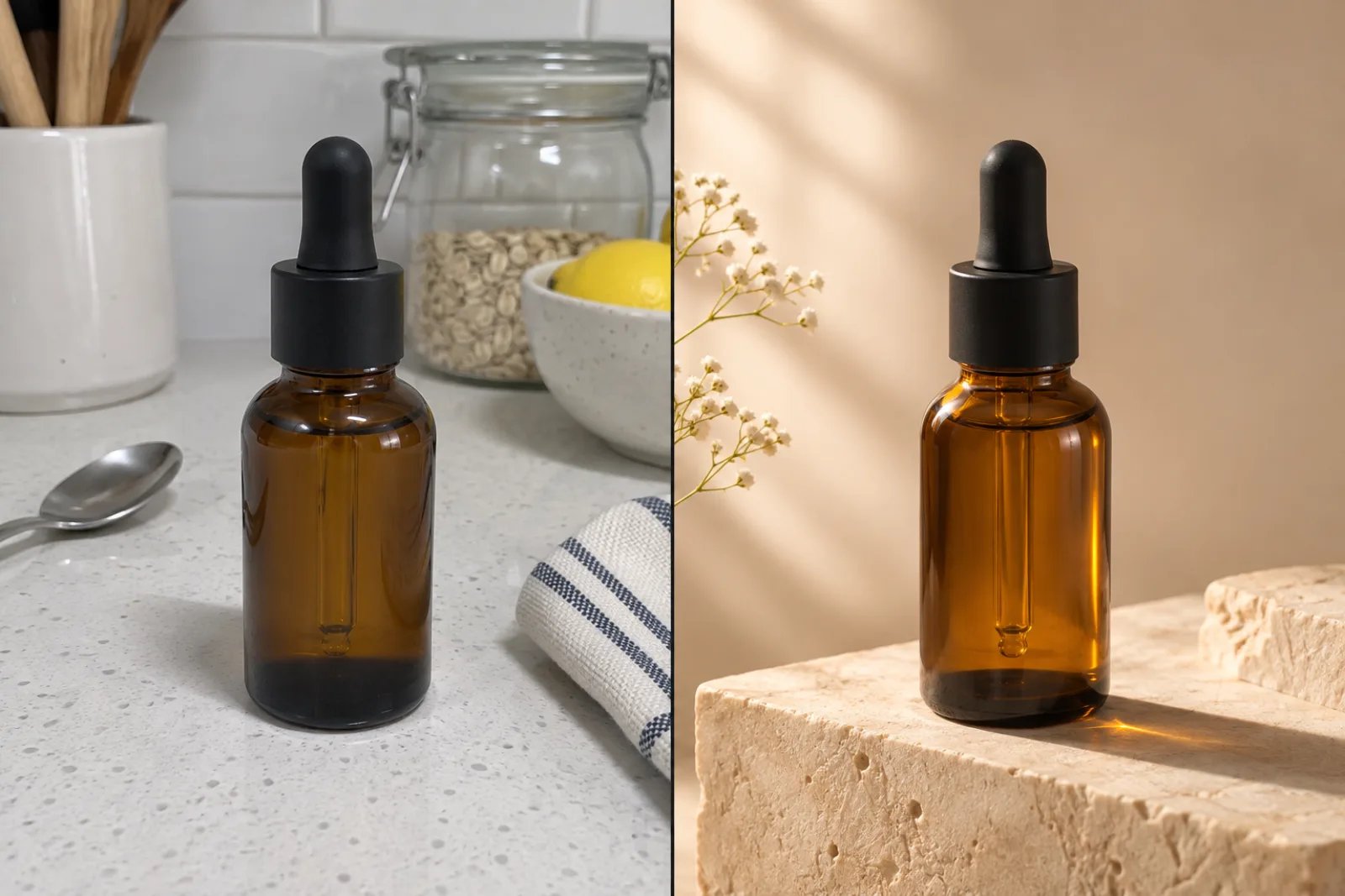
Most AI image advice is written for a blank page. You type a fantasy scene, you get a fantasy scene, and the exercise ends there. That is not the job most people actually have. The job looks like this: a serum bottle exists, it has been photographed badly on a kitchen counter, a campaign launches on Friday, and nobody is booking a studio. Or a small brand has sixty SKUs and needs each one in three formats for a seasonal push. Or a comic artist needs the same courier drawn eleven times without the face wandering off model.
Those tasks have a shape in common. Something real has to survive the render: a product silhouette, a label, a face, a room. And something has to be invented around it: light, set, mood, format. The interesting question is no longer "can an AI draw?" It is "which parts of this picture am I allowed the model to touch?"
That question is why the Nano Banana family got adopted so fast. Nano Banana AI is the popular name for Google's Gemini image model, the one that made conversational photo editing feel ordinary. It arrived in August 2025 as the thing that could take a photo you already had and change one described thing about it while leaving the rest alone. Nano Banana Pro followed in November 2025 with 4K output and readable lettering. Nano Banana 2 followed in February 2026 with Pro-level reasoning at Flash speed. Today a search for Nano Banana AI Image Generator or Nano Banana AI Photo Editor returns dozens of browser tools that wrap one or more of those models behind a credit counter.
This guide is a how-to about the campaign, not the chronology. The worked example is Nano Pro at nanopro.app, read on November 4, 2026: three Gemini image models side by side in one browser tab, plus a picker of other engines. It is an independent web workspace. It is not a Google product, and nothing here is a claim about Google's own pricing or quotas. This page is a guide on happyhorse2.video. Happy Horse 2 makes short video from photos and prompts, does not run this image workspace, and a credit balance in one place does not spend in the other.
The five searches are one job with three variables
People arrive at this topic with different words, and the words hide three separate decisions.
Nano Banana AI is the family name. It covers the original model and, loosely, everything descended from it. It is the phrase people use when they want "the one that edits photos properly," as opposed to the older text-to-image era where a prompt gave you a lottery ticket.
Nano Banana AI Image Generator is the generation-shaped request. Someone wants a picture that does not exist yet. Product concept, blog illustration, ad creative, packaging mock-up. The relevant controls are prompt, style, aspect ratio and resolution.
Nano Banana AI Photo Editor is the edit-shaped request. Someone has a picture and wants one specific thing different. Background, season, weather, wardrobe, lighting, the stranger in the back of the shot. The relevant control is not the prompt style but the preservation instruction: what must not move.
Nano Banana Pro is a model choice, not a task. It is the heavyweight. More reasoning, better fine detail, better lettering, 1K through 4K, up to fourteen references with a specific mix of objects, characters and style frames.
Nano Banana 2 is also a model choice, and it is the one most people should start with. It runs on Gemini 3.1 Flash Image, reaches 512 pixels through 4K, accepts up to fourteen references, handles unusual shapes such as 21:9 and extreme 8:1 strips, and can ground a prompt in web results. Google's own announcement framed it as bringing "the best of both worlds" — Pro's knowledge and quality, at Flash speed — and made it the default image model across the Gemini app.
A how-to that treats those five phrases as five different apps will send a reader through the wrong model picker and then charge them for it. The honest framing is: two of them are jobs, two of them are models, and one is the umbrella. Pick your job first, then your model, then your format. This guide follows that order.
What actually changed, and why it matters for a campaign
Three technical shifts turned image models from novelty into production tools, and each one maps onto a line item in a marketing budget.
Resolution stopped being the ceiling. The original Nano Banana produced roughly 1024 by 1024 pixels. That is fine for a social post and useless for a marketplace listing that buyers will zoom into, or a print piece. Pro and Nano Banana 2 both reach 4K, which means a generated product shot can survive a zoom.
Text became readable. Earlier diffusion models produced letters that looked right at thumbnail size and dissolved into nonsense up close. The newer Gemini image models render real words in multiple scripts, and Nano Banana 2 can even translate text inside an image while keeping the layout. That opens up posters, packaging mock-ups and price cards. It does not make them trustworthy: every letter still needs reading at full size before publication.
Many references, one frame. Nano Banana 2 accepts up to fourteen reference images, distributed as up to ten object references and four character references. Pro accepts the same total with a different mix: six objects, five characters, three style frames. Either way, you can hand the model your actual bottle, your actual logo, your actual mascot and a style frame, and describe how they relate. This is the shift that makes consistency a process instead of a prayer.
The catch, and it is a real one, is that capable models are still general. They do not know that an Amazon main image wants a pure white background, that a YouTube thumbnail is judged at 320 pixels wide, or that a comic needs the same jacket in panel six as panel one. That gap is what a workspace like Nano Pro is trying to fill: three models, one prompt box, visible credit cost before you commit.
Step one: decide what must survive
Before you touch a tool, write two lists. It takes four minutes and saves entire afternoons.
The must-survive list. What in this image is not negotiable? For a product: silhouette, cap geometry, label placement, label colour, material finish. For a person: face, hairline, skin tone, body proportions. For a room: wall positions, window placement, floor line. For a brand: logo shape, exact wording, palette.
The may-change list. Background, surface, lighting direction, time of day, props, mood, colour grade, crop, aspect ratio.
Everything the model is allowed to invent lives in the second list. Everything in the first list becomes an explicit preservation instruction in your prompt, and a checklist when you review the output. This is the single habit that separates a usable campaign asset from an almost-right image you have to regenerate four times.
A concrete example. Weak prompt: "Make this serum bottle look premium." Better prompt: "Restage the amber dropper bottle on a warm limestone plinth in soft directional window light from the left, deep cream seamless backdrop, long soft shadow, 4:5 vertical. Keep the bottle silhouette, the black dropper cap, the cap height and the blank label area exactly as they are. Keep the three-quarter angle and the bottle's position in frame."
The second prompt is longer, and every extra clause is doing work. It names the change, it names the preservation, and it names the format. Models follow that structure far more reliably than they follow adjectives.
Step two: choose the model on purpose
Three models, three jobs. The temptation is to always pick the biggest one. That is usually a way to spend four times the credits on a draft.
Nano Banana, the original, is the draft engine. On Nano Pro it costs 15 credits and returns in roughly twenty seconds at standard resolution. Use it for composition tests: does the bottle sit right on the plinth, is the crop correct, is the light coming from the direction you want. You are buying information, not a final file. Do not agonise over a stray reflection at this stage.
Nano Banana 2 is the workhorse, and the default recommendation. On Nano Pro it runs 30 credits at 1K, 40 at 2K and 60 at 4K. It reaches 4K, it accepts fourteen references, it handles extreme aspect ratios, and it grounds prompts in web knowledge, which helps when the scene depends on a real place, a real object type or a current design trend. For most product, social and web work, this is the model you finish on.
Nano Banana Pro is the precision instrument. On Nano Pro it runs 60 credits at 1K or 2K and 80 at 4K. It thinks before it renders, which pays off on dense scenes, infographics, diagrams, multi-language lettering and brand-critical layouts where the model has to hold several constraints at once. Reach for it when the image carries exact copy, or when the brief has more than about four simultaneous requirements.
A practical sequence that keeps costs sane: two or three drafts on the fast model to settle composition, one pass on Nano Banana 2 at 2K to judge detail, then a single 4K run on whichever of the two earned it. If the image contains a headline that must be spelled correctly, skip straight to Pro at 1K, confirm the lettering, then re-run the keeper at 4K.
Step three: build the prompt in five parts
The prompt structure that works on this model family is not a list of keywords. It is a short brief. Five parts, in this order:
- Operation. Start with a verb that names the job: restage, replace, relight, extend, combine, remove. The model reads the first clause as the instruction type, and getting it wrong wastes the rest of the prompt.
- Subject and preservation. What is in the frame, and what must not change. Name the specific elements: "the black dropper cap," "the blank label area," "the three-quarter angle."
- Set. Surface, background, props, and what is deliberately absent. Positive framing beats negation. "An empty limestone surface with a plain cream backdrop" is more reliable than "no clutter."
- Light and camera. Direction, quality, time of day, then distance and angle. "Soft directional window light from the left, long soft shadow" and "medium shot, three-quarter angle, shallow depth of field" are both concrete enough to steer the render.
- Format. Aspect ratio and resolution, plus what the image is for. "4:5 vertical for a paid social placement with empty space at the top for a headline" tells the model to compose for type even if it renders none.
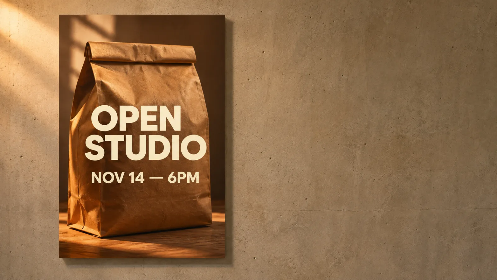
Two habits sharpen this further. First, one change per round. If you ask for a new background and warmer light and a different crop, and the result is wrong, you cannot tell which instruction failed. Change one thing, look, change the next. Second, quote anything that must be spelled exactly. When the brief includes a headline, put the words in quotation marks and say how they should look: "OPEN STUDIO" in a bold cream sans-serif. Then read every letter at full size.
Step four: use references as roles, not as a pile
The reference tray is where most people leave value on the table. Fourteen slots invites hoarding. The model does better with a small, purposeful set where each file has a stated job.
Google's own prompting guidance is explicit about this: name the role of each input. "Use Image 1 for the product shape and label, Image 2 for the surface and light, Image 3 for the colour palette." That sentence is worth more than three extra references.
A working reference set for a product campaign looks like this:
- One clean packshot on a plain background, sharp, whole product visible, label readable. This carries identity.
- One lighting reference, ideally a photo whose light you already like. This carries mood.
- One style frame, a previous campaign image or a competitor aesthetic you are deliberately echoing. This carries finish.
- Optionally, one composition reference when the layout matters more than the subject, such as a poster with a specific type block.
Resist the urge to add a reference for "the vibe." If you cannot say what a file is for in one clause, drop it. Extra inputs do not add precision; they add ambiguity, because the model has to reconcile them.
Step five: make a set, not a picture
A campaign is never one image. It is the same thing in several formats, or the same character in several scenes, or the same product on several surfaces. Consistency across a set is a different problem from quality in a single frame, and it has its own method.
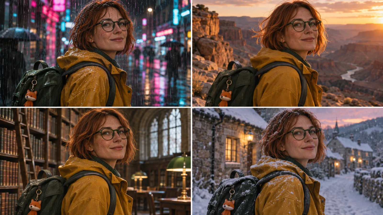
Write an identity block once, then stop editing it. For a character or a product, draft a fixed paragraph covering the elements that must never drift, and paste it verbatim into every prompt in the series. For a character: age range, build, hair with specific colour and cut, glasses shape, coat colour, one signature prop. For a product: exact silhouette, cap, label position, material finish. Then vary only one thing per render, action or location or camera.
Promote your best image to reference. Once one frame in the series looks right, use it as the primary reference for the next one. This compounds. Each approved frame narrows the model's freedom in a direction you have already chosen. Keep the identity block and the reference order unchanged so you can tell whether a drift came from the prompt or the inputs.
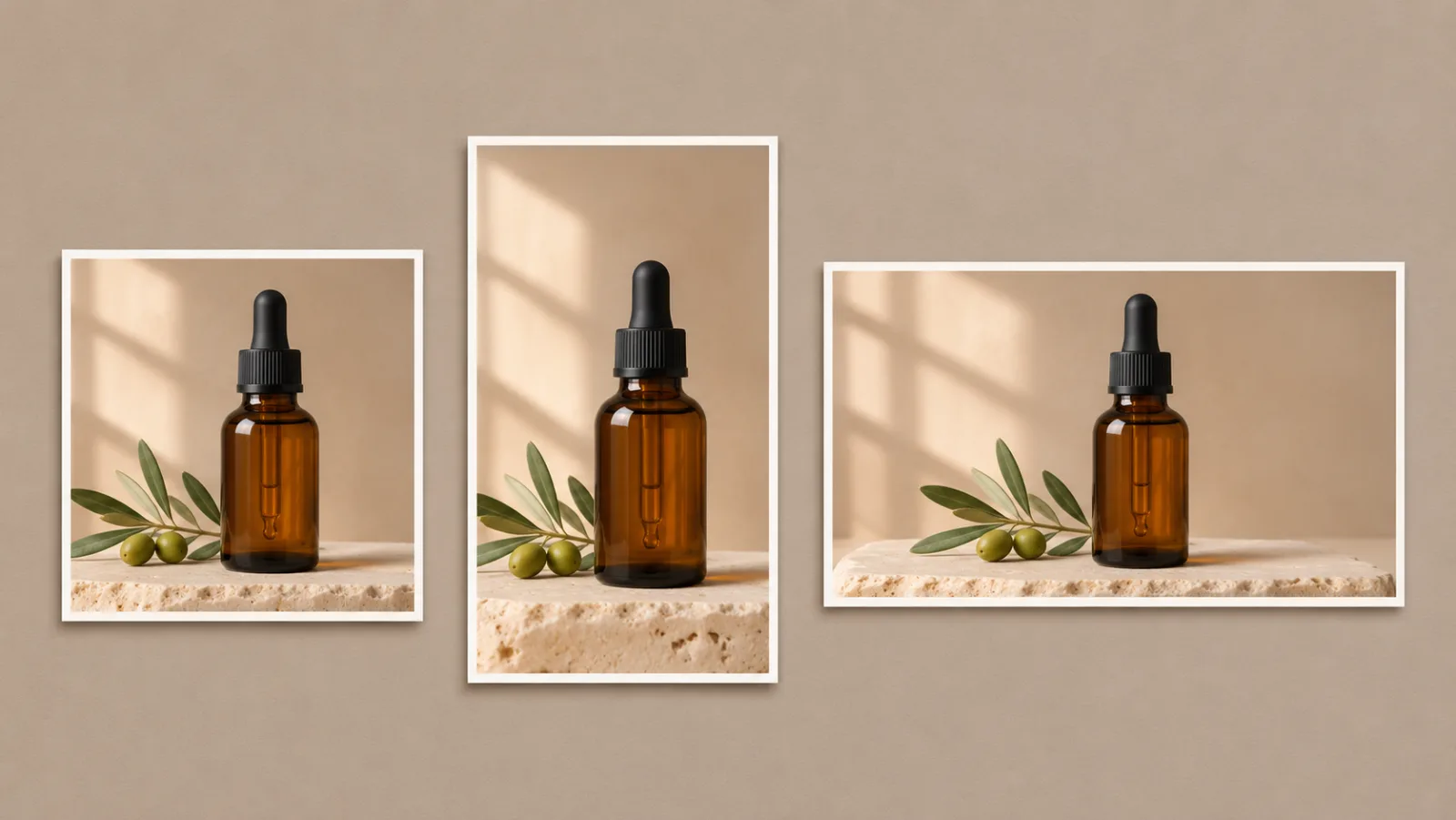
Lock the format early. Decide the deliverables before you render: one square for the grid, one 4:5 for the paid placement, one 16:9 for the site header. Compositing for three formats after the fact means three crops of one composition, and at least one will be wrong. Compositing for them during generation means three images that were designed for their slots.
Review at the size the audience sees. A product detail that looks immaculate at 4K can vanish into mush at a marketplace thumbnail. A face that reads clearly on a monitor can turn ambiguous at 320 pixels. Check every finalist at its real display size, not just at full resolution.
Step six: read the render like a proofreader
This is the step that gets skipped, and it is the step that decides whether the asset ships. Generative edits fail in predictable places.
- Lettering. Read every word character by character. Check that nothing extra appeared, that punctuation survived, and that small print did not become texture. Treat rendered text as a draft until proven otherwise.
- Product geometry. Compare cap height, neck width, label border, pump shape and base against the real item. Models round corners. They simplify hardware. They occasionally add parts.
- Reflections and glass. Glass thickness, liquid level, highlight shape and the reflection of a surface that is not there.
- Hands and touch points. Fingers holding a product, a strap crossing a shoulder, a cup meeting a lip.
- Seams and continuations. In an extended frame, look along the old border, not at the subject. Repeating texture that changes scale, a shadow that stops, a horizon that bends.
- Lighting logic. Two shadows where there is one light source. A highlight on the wrong side. A falloff that does not match the described window.
- Words you did not ask for. Street signs, packaging copy, book spines, screen text. Generated environments love to invent signage.
The professional habit is to put the render next to the source at the same size and flick between them. Whatever moved is either an intentional change or a defect. There is no third category.
Step seven: know the licence before the launch
Rights are the least glamorous part of this workflow and the part most likely to cost real money.
Three separate questions hide inside "can I use this?"
Do I have rights in the input? A photo you took, a product you own or are authorised to advertise, a face that has consented. Uploading someone else's photograph and restyling it does not create a licence in the original. The same is true of a logo you do not own, a celebrity likeness, or a client asset you were given for a different purpose.
Does the plan grant commercial use? On Nano Pro, plans that list a Commercial Use License cover business use such as ads, listings and client deliverables, and paid plans remove the watermark; the free grant of 15 welcome credits produces one image on the fast model with a small watermark. Read the specific card you are buying, because feature lists differ between tiers. A promotional price found in a review from two months ago is not a contract term.
Does the platform where you publish require disclosure? Several marketplaces and social platforms now ask for labelling of realistic AI-generated or AI-altered imagery. Google's own models embed C2PA Content Credentials and a SynthID watermark in output. Neither replaces a disclosure requirement, and neither absolves you of the accuracy obligation in an ad.
There is also a plain commercial argument for honesty. A generated lifestyle scene that quietly changes your packaging is worse than no scene at all, because it produces a customer expectation you cannot fulfil.
Step eight: price the work, not the image
Credits are easy to compare and easy to misread. The number that matters is cost per finished deliverable, not cost per render, because most campaigns need more than one attempt per image.
Work the arithmetic backwards from a real job. Say a small skincare brand needs ten products, each in three formats, and each needs one rejected draft before it lands. That is thirty finals and thirty rejects. On the fast model at 15 credits a render, sixty renders is 900 credits. On Nano Banana 2 at 2K, the same sixty renders at 40 credits is 2,400. On Pro at 4K, it is 4,800. The gap between those numbers is not a discount question; it is a question about whether the job needs 4K at all. A paid social placement at 1080 by 1350 does not.
Two rules keep the bill honest. Draft cheap, finish expensive. Settle every composition question on the cheapest model that can answer it. Budget a reject rate. If you assume every image lands first try, you will under-buy every plan. One spare run for every two or three finals is a realistic allowance.
For reference, Nano Pro's published rates at the time of writing are 15 credits on the original model, 30 to 60 on Nano Banana 2 depending on resolution, and 60 to 80 on Pro, with other engines in the picker starting at 10. New accounts get 15 welcome credits valid for 30 days, enough for exactly one fast render. Plans include a yearly Starter at roughly $9.90 a month equivalent with 9,600 credits, a Pro tier around $19.90 with 24,000, and a Studio tier around $44.90 with 72,000. Promotions move, so check the Nano Pro pricing page before you commit rather than trusting a figure quoted in an article.
Where this workflow breaks
Every honest guide needs the failure cases, and these are the ones that show up repeatedly.
The edit that redraws everything. You ask for a new background and get a new bottle. It happens when the preservation instruction is missing, or when the requested change is so large that the model has to regenerate the subject to make it fit. Shrink the ask. Change the background only, with the subject explicitly named as fixed, and see whether identity holds before you ask for more.
The label that improves itself. Models have priors about what packaging looks like, and those priors can overwrite your actual packaging. If the label is the product, generate the scene around a clean packshot and composite the real label in a layout tool, rather than trusting the render.
The set that drifts. Ten images, ten slightly different versions of the same character. Usually the cause is a reference set that grew between renders, or an identity block that got "improved" halfway through. Freeze both.
The text that nearly works. Almost-right lettering is more dangerous than obviously broken lettering, because it survives a glance. If a headline must be exact, render the image without type and set the type yourself. That is not a failure of the tool; it is a correct division of labour.
The licence assumption. "I paid for a plan, so I own this." A plan grants a licence to the output. It does not grant rights in the input, and it does not override the rules of the marketplace where you publish.
A checklist to run before you spend credits
- The must-survive list is written down, and every item appears in the prompt as a preservation instruction.
- The model choice matches the job: draft on the fast model, finish on Nano Banana 2, escalate to Pro for exact copy or dense layouts.
- The prompt has five parts: operation, subject and preservation, set, light and camera, format.
- Each reference has a stated role, and no reference is there for "the vibe."
- The aspect ratios match the actual placements, and the composition was designed for each one.
- You are changing one variable per round.
- The identity block for a character or product series is frozen and reused verbatim.
- Every finalist has been read at its true display size, with lettering, geometry, reflections, hands and seams checked against the source.
- You know whether the plan grants commercial use, and you have the rights in every input.
- You have budgeted a reject rate, and the plan's credit allowance covers it.
The short version
Nano Banana AI is a family of models, not a single app, and the useful skill is matching the model to the job. Nano Banana AI Image Generator is the blank-page request; Nano Banana AI Photo Editor is the change-one-thing request; Nano Banana Pro is the precision instrument for dense layouts and exact lettering; Nano Banana 2 is the fast workhorse that reaches 4K and holds fourteen references; and a workspace like Nano Pro is one place where all of it sits behind one prompt box and one credit balance.
The craft is not in the prompt adjectives. It is in the two lists — what must survive, what may change — and in the discipline of reviewing the render the way you would proofread a page. Generate cheap, finish expensive, freeze what works, and check the details that carry your brand before anything goes live.
If you want to test the workflow on your own product, start with one photograph you already have. Write the two lists, draft on the fast model, finish one image on Nano Banana 2 at 2K, and compare it against the real item before you spend credits on a 4K set.